Skip to content

Case Study
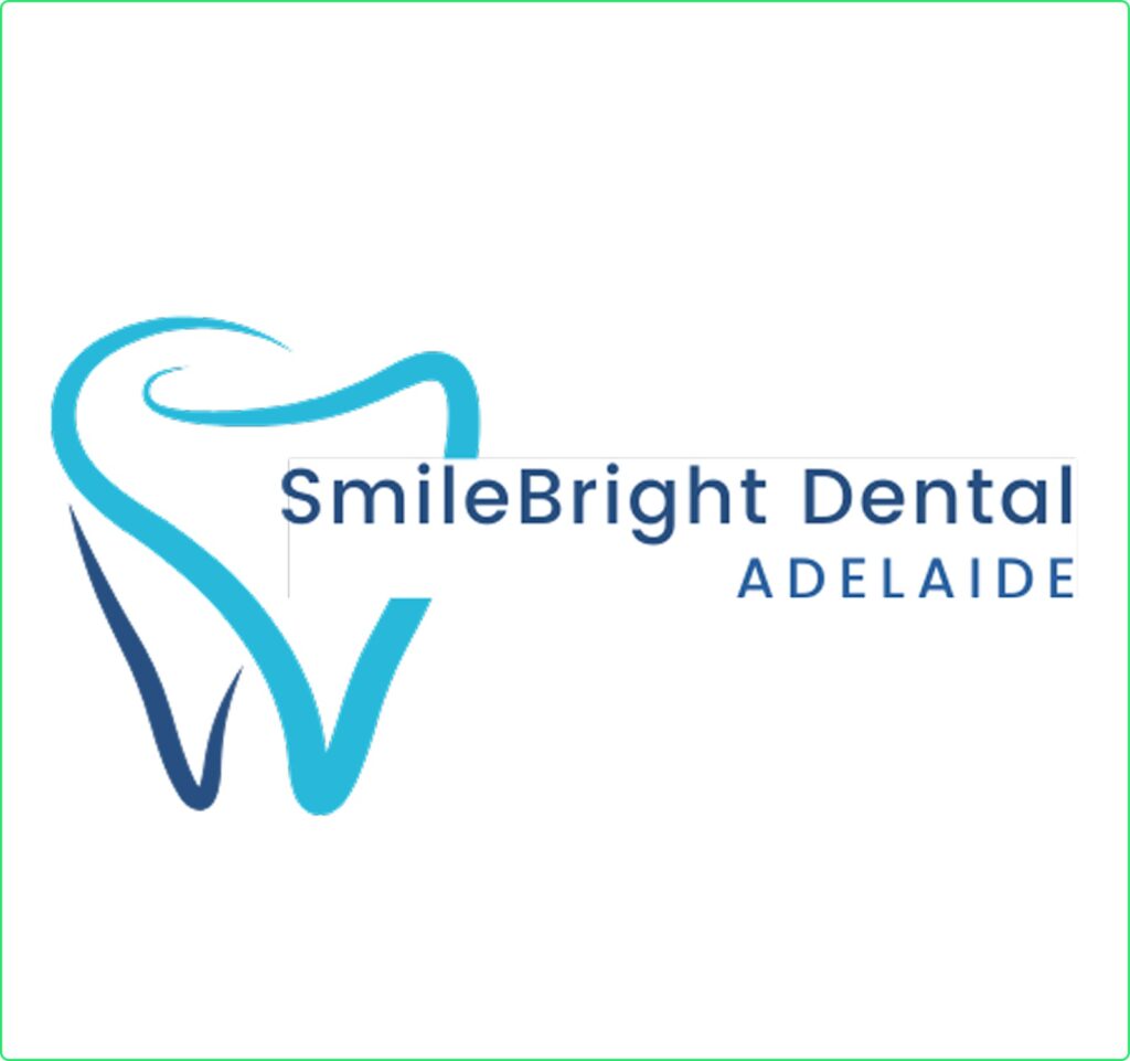
Solvars Revamps Bright SmellBright Dental Clinic’s Digital Presence
Date
14th March, 2025
Client
Dr. Ethan Collins
Satisfaction Rate
Location
Adelaide(Australia)
The Logo Design Journey for Solvars
At Solvars, we understand that a dental clinic’s brand identity should inspire trust, professionalism, and care. SmileBright Dental needed a modern, approachable, and clean logo that reflected their high-quality dental services and patient-friendly approach.
Our goal was to create a fresh, inviting logo that communicated dental expertise, hygiene, and confidence, making the brand stand out in a competitive industry.
Concept & Design Approach
Our design strategy focused on simplicity, clarity, and a welcoming aesthetic to help SmileBright Dental connect with both new and returning patients.
Typography: A clean, modern sans-serif font to emphasize professionalism and clarity.
Symbolism: A stylized tooth with a radiant glow, symbolizing oral health, hygiene, and confidence.
Color Palette: Trustworthy blue paired with crisp white to reflect cleanliness and reliability.

We conducted in-depth research to ensure the SmileBright Dental logo aligned with industry trends and patient expectations.
Industry Analysis: Studied leading dental clinic logos for inspiration and differentiation.
Competitor Research: Identified common branding elements and worked to create a unique yet professional identity.
Target Audience: Focused on patients seeking advanced dental treatments, family-friendly services, and aesthetic dentistry.
The research showed that a minimalist, blue-and-white dental logo would best communicate expertise, care, and hygiene.
We explored different design elements and refined them into a sleek and patient-friendly brand identity.
Iconic Symbolism: The tooth icon was designed with a subtle shine effect, symbolizing healthy, bright smiles.
Minimalist Design: A clean, uncluttered logo to ensure a professional yet approachable feel.
Calming Color Palette: Blue represents trust and professionalism, while white emphasizes purity and cleanliness.
We followed a structured three-phase design process to ensure the final logo was both aesthetically pleasing and strategically effective.
Sketching & Ideation:
Brainstormed different tooth-inspired icons with dynamic, smooth curves.
Created hand-drawn sketches to explore variations of the tooth and smile elements.
Digital Refinement:
Converted sketches into vector-based logos using Adobe Illustrator for precision.
Tested different fonts, icon placements, and spacing to maintain a clean, professional aesthetic.
Ensured the logo remained versatile across different branding materials.
Finalization & Branding Integration:
Provided multiple logo versions (primary, monochrome, and icon-only) for website, signage, and promotional use.
Delivered a branding style guide with color codes, typography, and placement guidelines.
Ensured the logo looked consistent across all digital and print platforms.
Challenges and Solution
SmileBright Dental wanted a logo that was modern, welcoming, and distinct from competitors.
✔ We designed a simple yet strong brand mark that conveys dental excellence and hygiene.
✔ The final logo was tested across multiple applications, ensuring it remained scalable, readable, and visually appealing.
✔ The brand identity helped establish trust and credibility, making SmileBright Dental a go-to choice for patients.
Results Driven
After launching the new logo, SmileBright Dental experienced positive brand recognition and engagement:
- Stronger Visual Identity – The logo immediately resonated with patients, improving brand recall.
- Professional & Clean Aesthetic – The design reinforced hygiene, care, and dental expertise.
- Seamless Digital & Print Integration – The logo was effectively used across website, social media, signage, and marketing materials.

Creative Logos by Solvars