Skip to content

Case Study
See How Solvars Transformed Power Plus Digital Presence with Cutting-Edge Solutions
Date
14th March, 2025
Client
Isabella Roberts
Satisfaction Rate
Location
Adelaide(Australia)
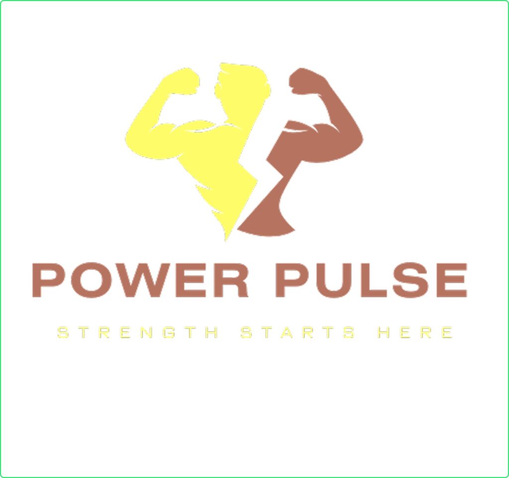
The Logo Design Journey for Solvars
At Solvars, we believe that a strong brand identity starts with a powerful logo. When PowerPulse Gym approached us, they needed a logo that reflected their commitment to strength, endurance, and fitness. Our goal was to create a design that was bold, energetic, and aligned with their vision.
Concept & Design Approach
We focused on creating a modern and dynamic logo that would instantly resonate with fitness enthusiasts. Key elements of the design include:
- Typography: A strong, bold typeface to symbolize power and determination.
- Symbolism: Integrated a minimalist dumbbell icon to emphasize fitness.
Before diving into the design, we conducted thorough research on:
✔ Industry Trends: Analyzed modern gym logos, color psychology, and typography used in the fitness industry.
✔ Competitor Analysis: Studied local and global gym brands to ensure uniqueness and competitive edge.
✔ Target Audience: Identified fitness enthusiasts, athletes, and beginners looking for motivation and strength training.
Through this research, we discovered that a bold, dynamic, and energetic logo would best resonate with PowerPulse Gym’s audience.
With the research insights, we brainstormed and sketched multiple logo ideas, focusing on:
🔹 Typography: Bold, strong fonts that convey power and determination.
🔹 Symbolism: A dumbbell icon integrated into the text to emphasize fitness.
We aimed to craft a design that not only looked powerful but also reflected the gym’s core values of strength and endurance.
Once the concept was finalized, we moved on to the execution phase:
✔ Sketching & Digital Drafts: We started with hand-drawn sketches and then created digital mockups using Adobe Illustrator.
✔ Typography Selection: Chose a strong sans-serif font that exudes confidence and professionalism.
✔ Symbol Integration: Designed a dumbbell-inspired icon subtly blended into the letterforms.
✔ Color & Refinement: Applied the selected yellow and black color scheme, ensuring contrast and visibility across various platforms.
Challenges and Solution
The Solvars logo is a perfect blend of creativity and innovation, designed to reflect our brand’s vision and identity. Through a thoughtful design process, we crafted a modern and dynamic mark that stands out in the digital space.
Results Driven
The Solvars logo is a perfect blend of creativity and innovation, designed to reflect our brand’s vision and identity. Through a thoughtful design process, we crafted a modern and dynamic mark that stands out in the digital space.
- Strong Brand Recognition
- Versatility Across Platforms
- Versatility Across Platforms
- Alignment with Brand Vision

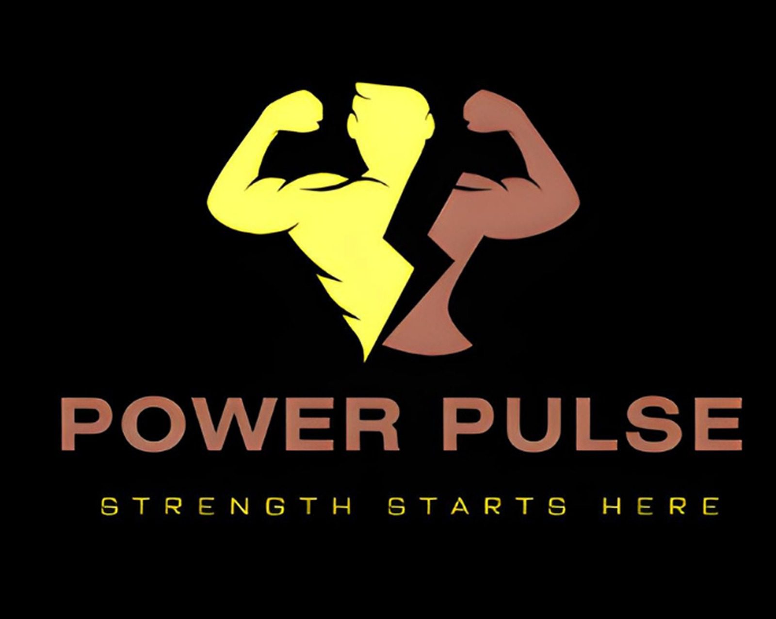
Creative Logos by Solvars