Skip to content

Case Study
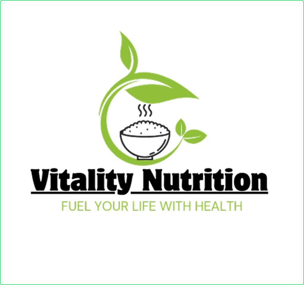
Energizing Wellness: A Vibrant, Health-Focused Logo for Vitality Nutrition
Date
14th March, 2025
Client
Daniel Foster
Satisfaction Rate
Location
Adelaide(Australia)
The Logo Design Journey for Solvars
At Solvars, we specialize in creating logos that capture a brand’s essence and values. When Vitality Nutrition approached us, they wanted a modern, fresh, and health-focused logo that would represent their mission of promoting balanced nutrition, wellness, and vitality.
Our goal was to design a simple yet powerful brand identity that reflected energy, health, and sustainability, making the logo instantly recognizable for their personalized diet and weight management services.
Concept & Design Approach
We focused on designing a logo that exuded freshness, vitality, and professionalism while remaining visually appealing. Key elements included:
Typography: A clean, modern sans-serif font for a contemporary and approachable feel.
Symbolism: A leaf integrated with a dynamic circular element to represent nutrition, growth, and balance.
Color Palette: Vibrant greens (#32CD32) symbolizing health and wellness, complemented by neutral tones (#F5F5F5) for balance and clarity.

Before beginning the design process, we conducted extensive research to ensure the logo aligned with Vitality Nutrition’s brand vision.
Industry Trends: Analyzed the best practices in health, wellness, and nutrition branding.
Competitor Analysis: Reviewed similar businesses to create a distinct and unique identity.
Target Audience: Identified individuals looking for healthy meal plans, weight loss solutions, and nutrition guidance.
Through this research, we established that a clean, nature-inspired logo would best reflect the company’s commitment to holistic health and well-being.
Using our research insights, we explored multiple logo ideas, refining them into a polished, visually appealing design.
Nature-Inspired Icon: A stylized leaf and circular element representing balance, growth, and nutrition.
Minimalist and Modern: A sleek design that conveys professionalism and trustworthiness.
Harmonious Color Scheme: Vibrant green for energy and health, paired with neutral tones for clarity and simplicity.
We followed a structured three-step approach to develop a timeless and versatile logo.
Sketching & Ideation:
Created initial drafts with various organic and abstract elements.
Focused on a clean and inviting design that aligns with the brand’s vision.
Digital Refinement:
Designed vector-based logos using Adobe Illustrator for scalability.
Experimented with different layouts, icon placements, and font pairings.
Tested the logo’s visibility and clarity on different platforms.
Finalization & Branding Integration:
Delivered the logo in multiple formats (PNG, SVG, AI) for seamless use across digital and print media.
Provided branding guidelines, including color codes, typography, and logo usage recommendations.
Ensured a consistent brand identity across business cards, websites, and social media.
Challenges and Solution
Vitality Nutrition wanted a logo that was both modern and nature-inspired while maintaining a professional and credible image.
✔ We developed a fresh yet authoritative brand identity that appealed to health-conscious clients.
✔ The logo effectively communicated the brand’s commitment to holistic wellness and balanced nutrition.
✔ The final design ensured recognizability and trustworthiness, helping Vitality Nutrition establish a strong market presence.
Results Driven
The new branding immediately delivered positive results:
- Enhanced Brand Recognition – The fresh and vibrant logo made the brand instantly identifiable.
- Versatility Across Platforms – The logo worked seamlessly on websites, packaging, and social media.
- Alignment with Brand Vision – The design accurately reflected the brand’s values of health, balance, and sustainability.

Creative Logos by Solvars