Skip to content

Case Study
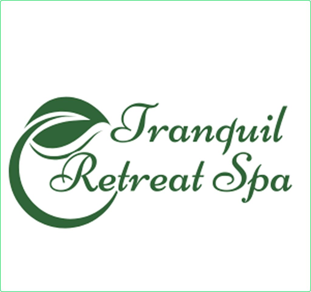
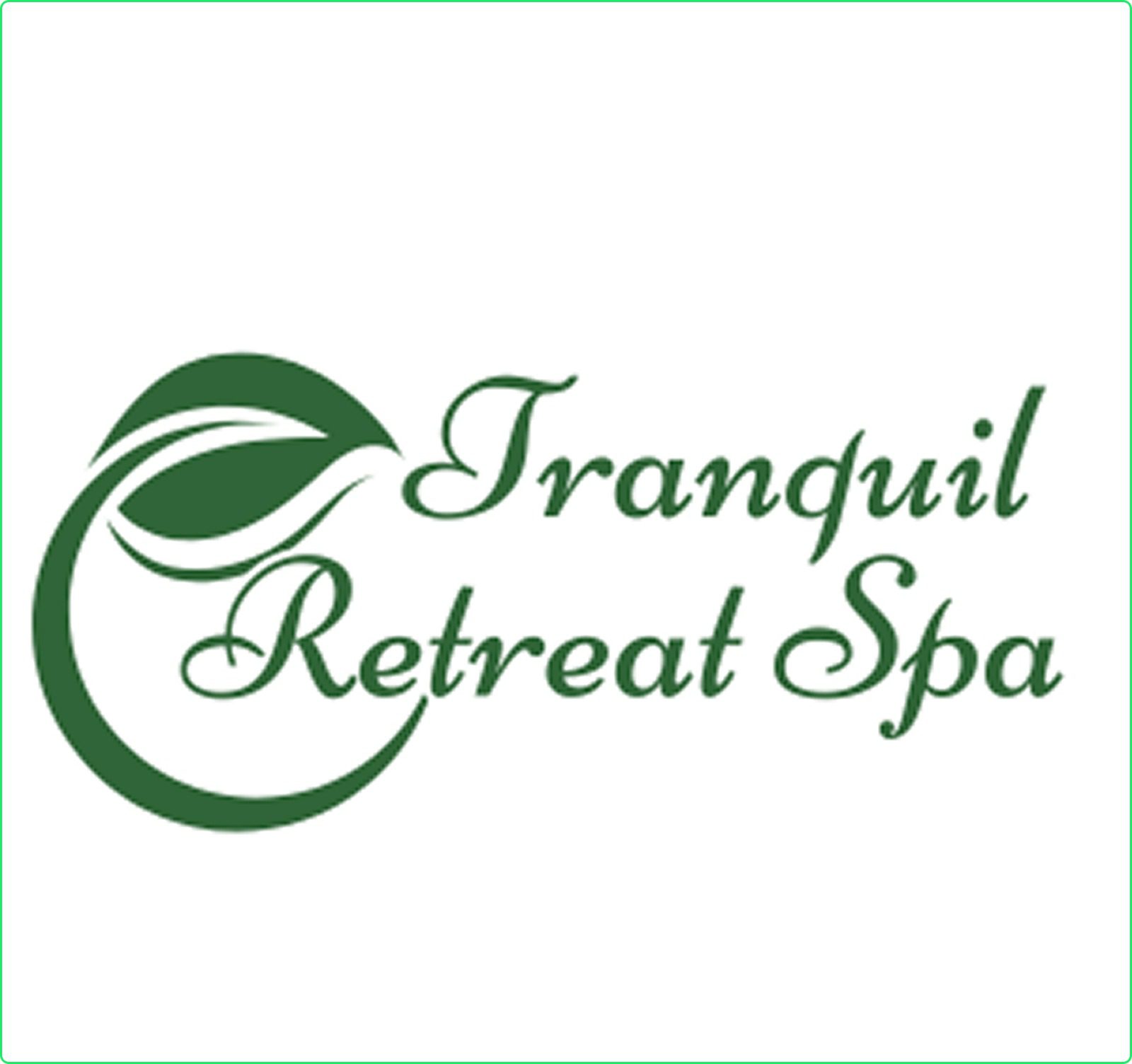
Serenity Refined: A Soothing, Nature-Inspired Logo for Tranquility Retreat Spa
Date
14th March, 2025
Client
Isabella Roberts
Satisfaction Rate
Location
Adelaide(Australia)
The Logo Design Journey for Solvars
At Solvars, we specialize in crafting logos that perfectly represent a brand’s vision, emotions, and unique identity. When Tranquil Retreat Spa approached us, they wanted a minimal yet luxurious logo that embodied peace, relaxation, and holistic wellness.
Our objective was to design a timeless, elegant logo that reflected the spa’s soothing treatments, high-end services, and tranquil ambiance, making the brand instantly recognizable and inviting.
Concept & Design Approach
Our creative team focused on a calm and sophisticated design, incorporating elements that align with wellness, nature, and relaxation.
Typography: Elegant serif font with a soft, flowing appearance to exude luxury and calmness.
Symbolism: A lotus flower integrated with fluid lines, representing serenity, rejuvenation, and balance.
Color Palette: Soft lavender (#E6E6FA) for tranquility, paired with earthy brown (#8B4513) to evoke warmth and nature.
To ensure an authentic brand identity, we conducted thorough research on spa branding, wellness aesthetics, and customer psychology.
✔ Industry Trends: Studied leading luxury spa brands and their visual identities.
✔ Competitor Analysis: Identified key branding gaps to create a unique identity.
✔ Target Audience: Focused on individuals seeking stress relief, skincare rejuvenation, and holistic wellness experiences.
Based on this research, we determined that a nature-inspired, soft-toned logo would best capture the spa’s essence while appealing to its clientele.
We explored multiple design variations, refining them into a polished and meaningful brand identity.
Symbolic Icon: The lotus flower represents purity, renewal, and relaxation—the core of spa experiences.
Soothing Design Elements: Curved, flowing lines evoke calm energy and tranquility.
Harmonized Color Palette: Lavender symbolizes calmness and relaxation, while earthy tones convey natural healing and warmth.
We followed a structured three-phase approach to craft a logo that perfectly aligns with Tranquil Retreat Spa’s brand philosophy.
Sketching & Ideation:
Brainstormed different elements such as water ripples, lotus flowers, and minimalist line art.
Created initial hand-drawn sketches to explore design possibilities.
Digital Refinement:
Converted sketches into vector-based logos using Adobe Illustrator for scalability.
Experimented with different typography styles and icon placements.
Ensured the logo was clean, timeless, and aesthetically pleasing.
Finalization & Branding Integration:
Delivered the logo in multiple formats (PNG, SVG, AI) for use in business cards, brochures, signage, and digital platforms.
Provided branding guidelines, including typography, color codes, and proper logo usage.
Ensured the logo maintained visual harmony across all branding materials.
Challenges and Solution
Tranquil Retreat Spa wanted a logo that felt luxurious yet approachable, while maintaining a calm and rejuvenating appeal.
✔ We created a delicate yet strong logo that communicates wellness, comfort, and sophistication.
✔ The final design reinforced brand trust and exclusivity, making it easy to recognize in the wellness industry.
✔ The logo was tested across various mediums, ensuring visibility and adaptability for print, web, and social media.
Results Driven
After launching the new brand identity, Tranquil Retreat Spa saw immediate positive engagement:
- Stronger Brand Recognition – Clients instantly connected with the soft, inviting aesthetic.
- Professional & Luxurious Appeal – The new identity positioned the spa as a premium wellness retreat.
- Increased Online & Offline Engagement – The logo seamlessly integrated into their website, social media, and promotional materials.
- Alignment with Brand Vision

Creative Logos by Solvars